Nick Terry_London_ —
Gallery Solo - Exhibition
7 Ledbury Mews North, London W11 2AF
Bartha_contemporary is pleased to showcase a selection of recent watercolours and colour-field watercolours by the Marfa-based artist Nick Terry.
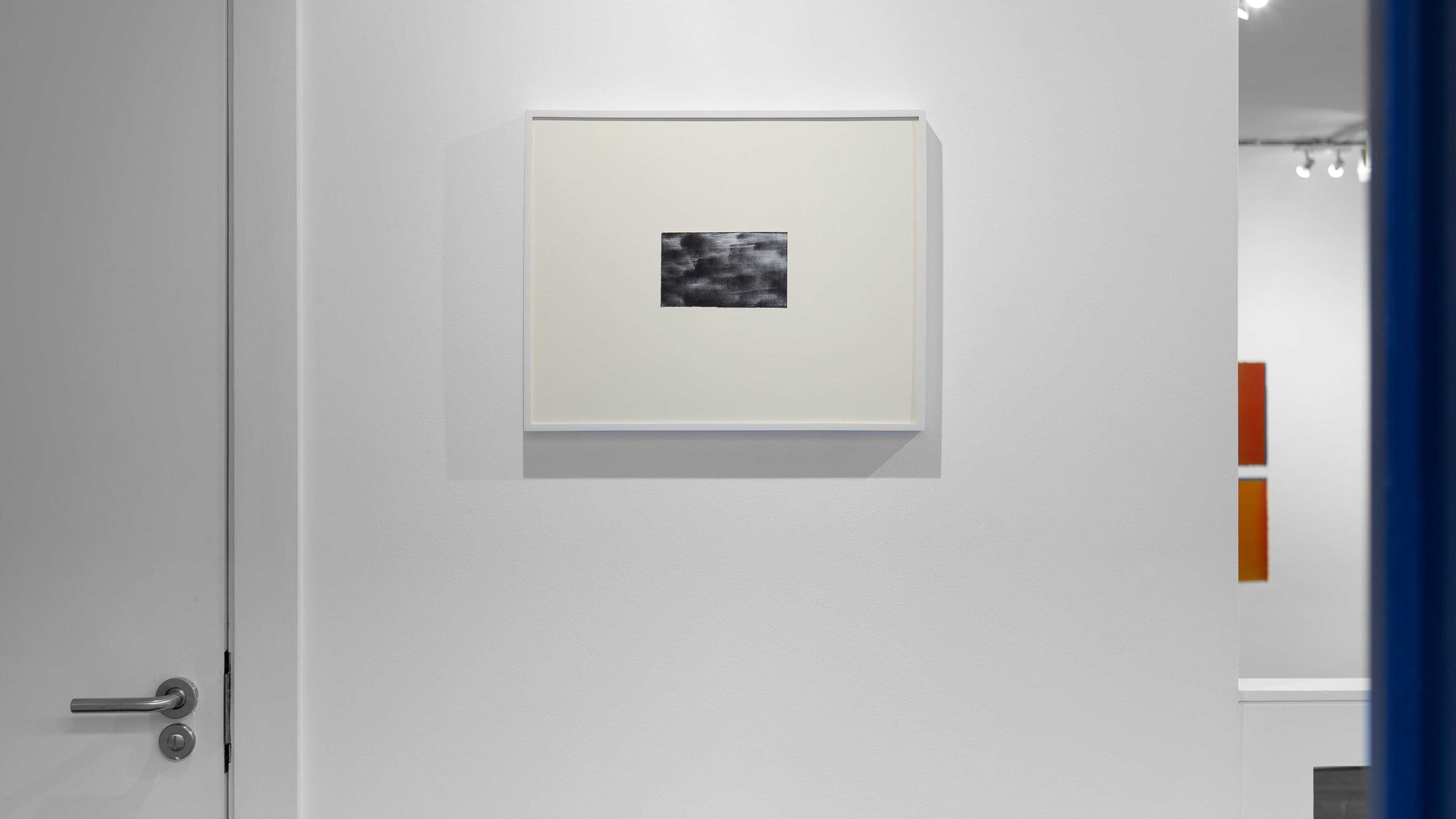
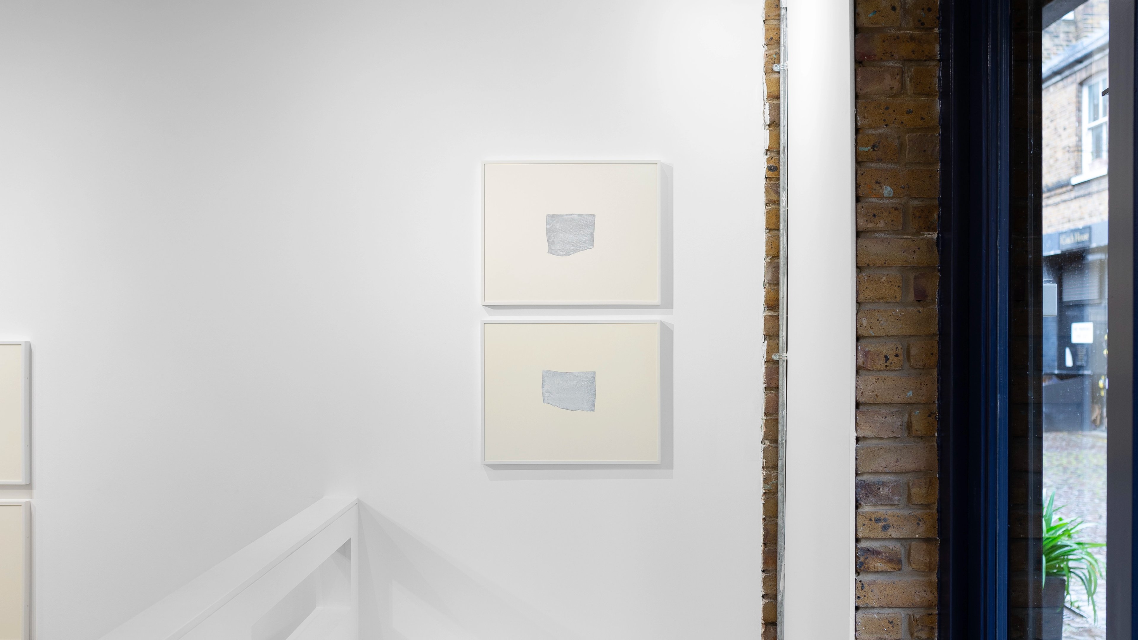
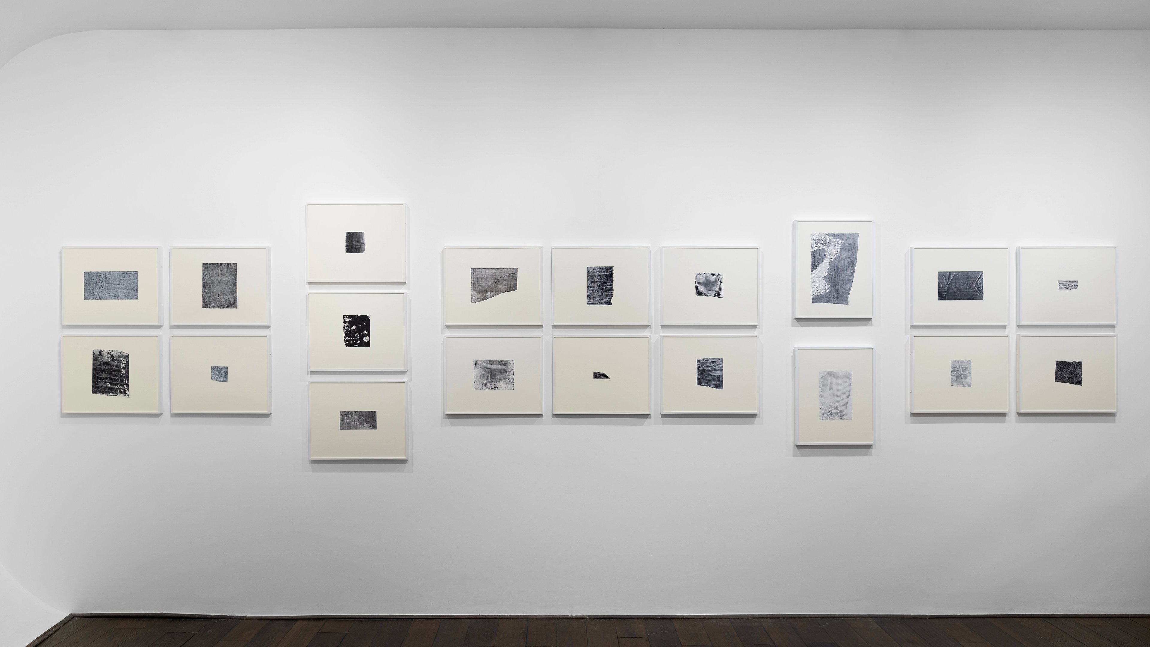
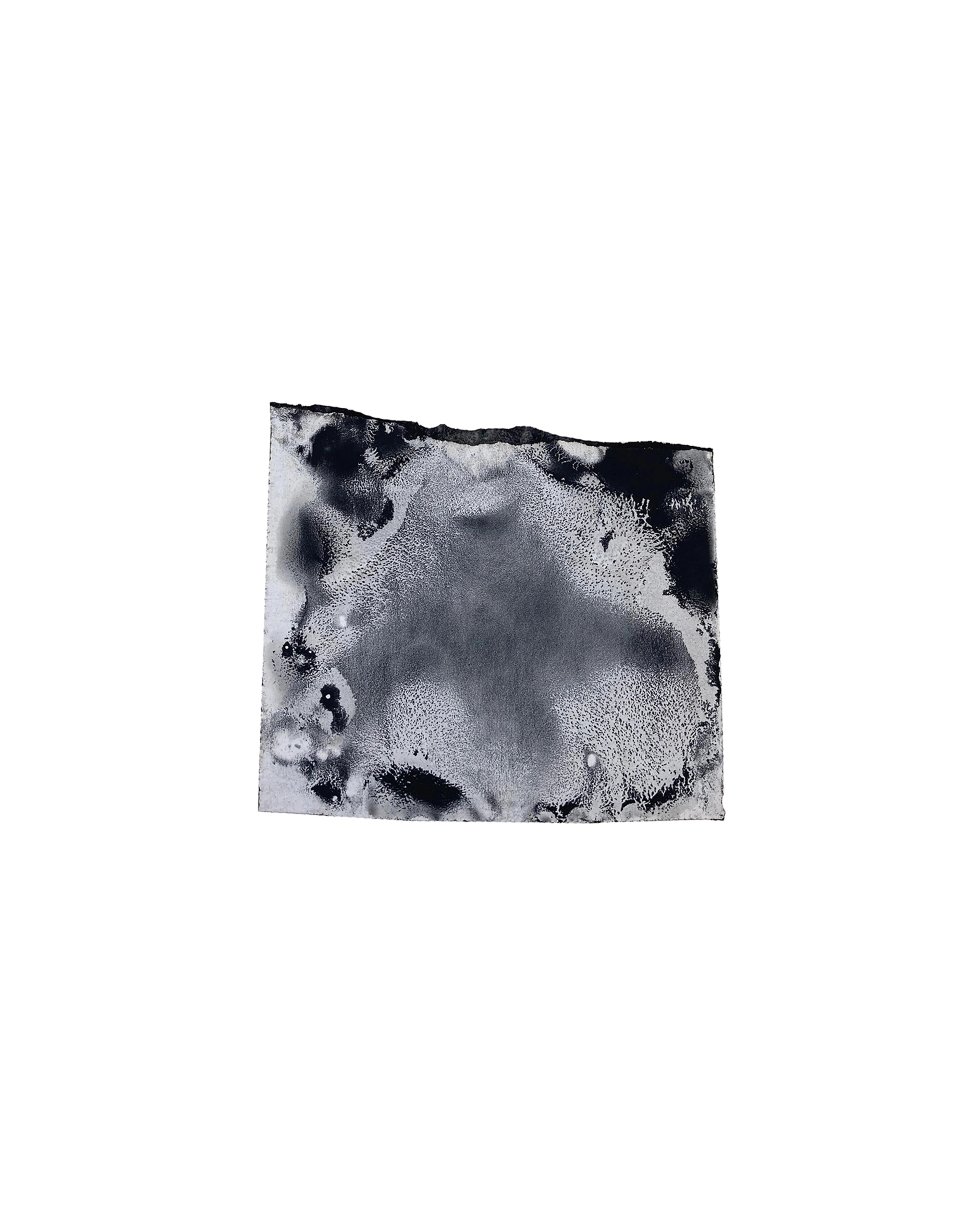
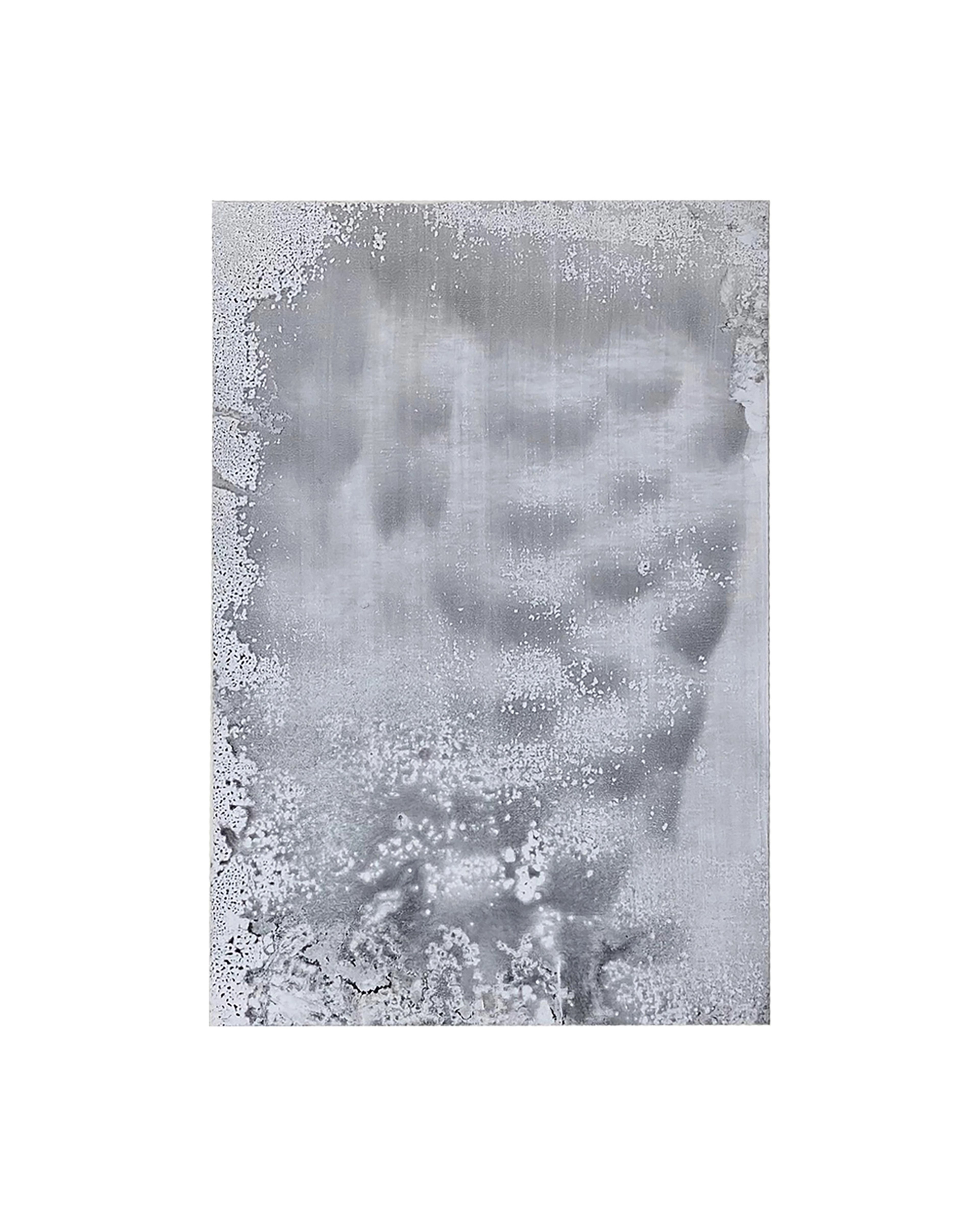
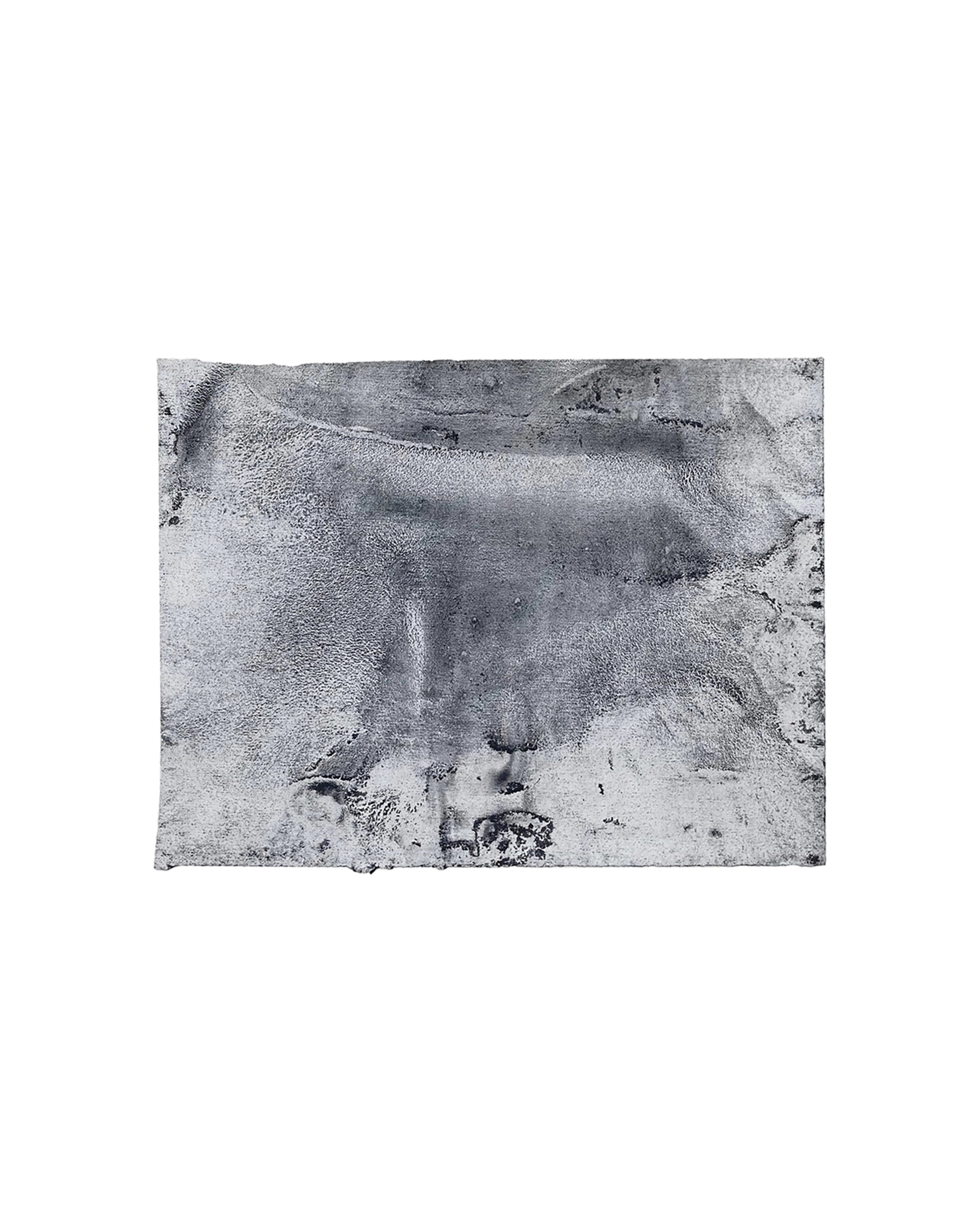
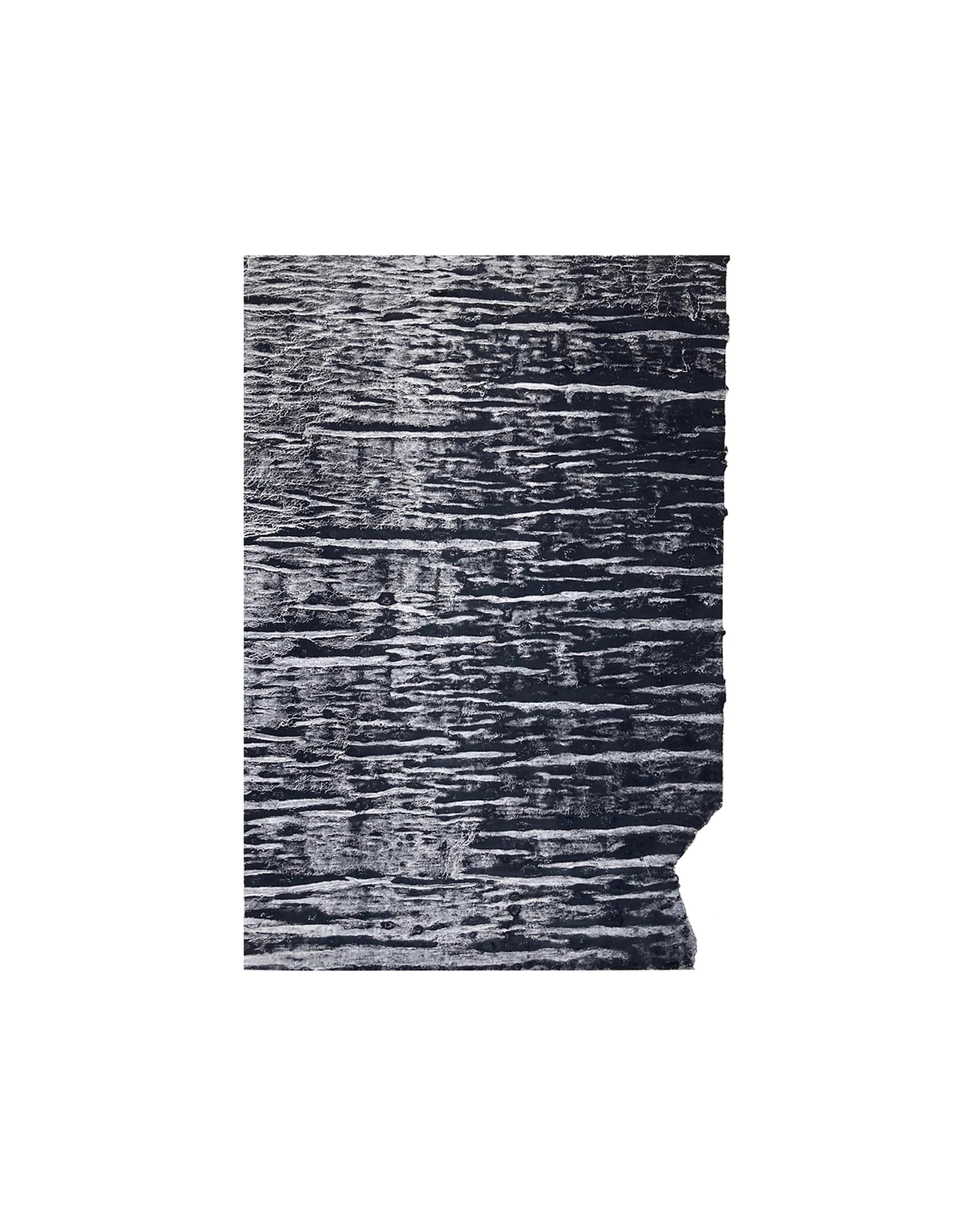
In an age where we are inundated with imagery, focusing on minute details is a luxury we rarely indulge in at present. Nick Terry’s watercolours invite us to do just that. These small-scale works demand a visual space far more significant than their size would imply; their highly textured appearance and intricate compositions feel surprisingly unidentifiable yet familiar.
Large rolls of vinyl-saturated papers and application tapes are substrates for Terry’s paintings. These thin, crepe-like papers induce the water-based paints, solutions he makes himself, to amalgamate into creeks, pools, and crevices. The various textures are enhanced by the choice to only employ black and white paints to create them. Terry often edits the scale and dimension of the original surface area he sets to work on, isolating and developing areas of interest, working free from the confines of a predetermined size and composition.
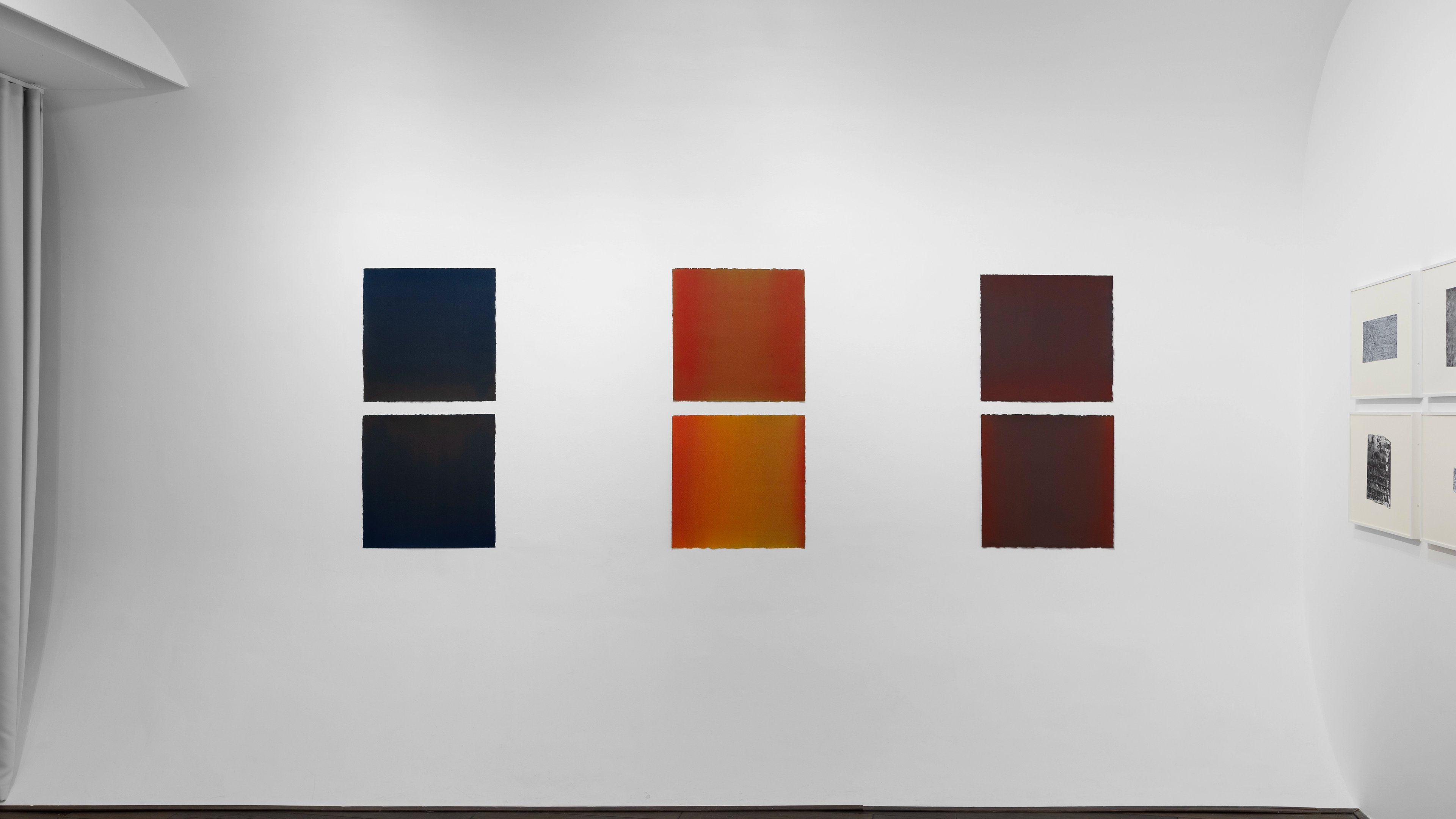
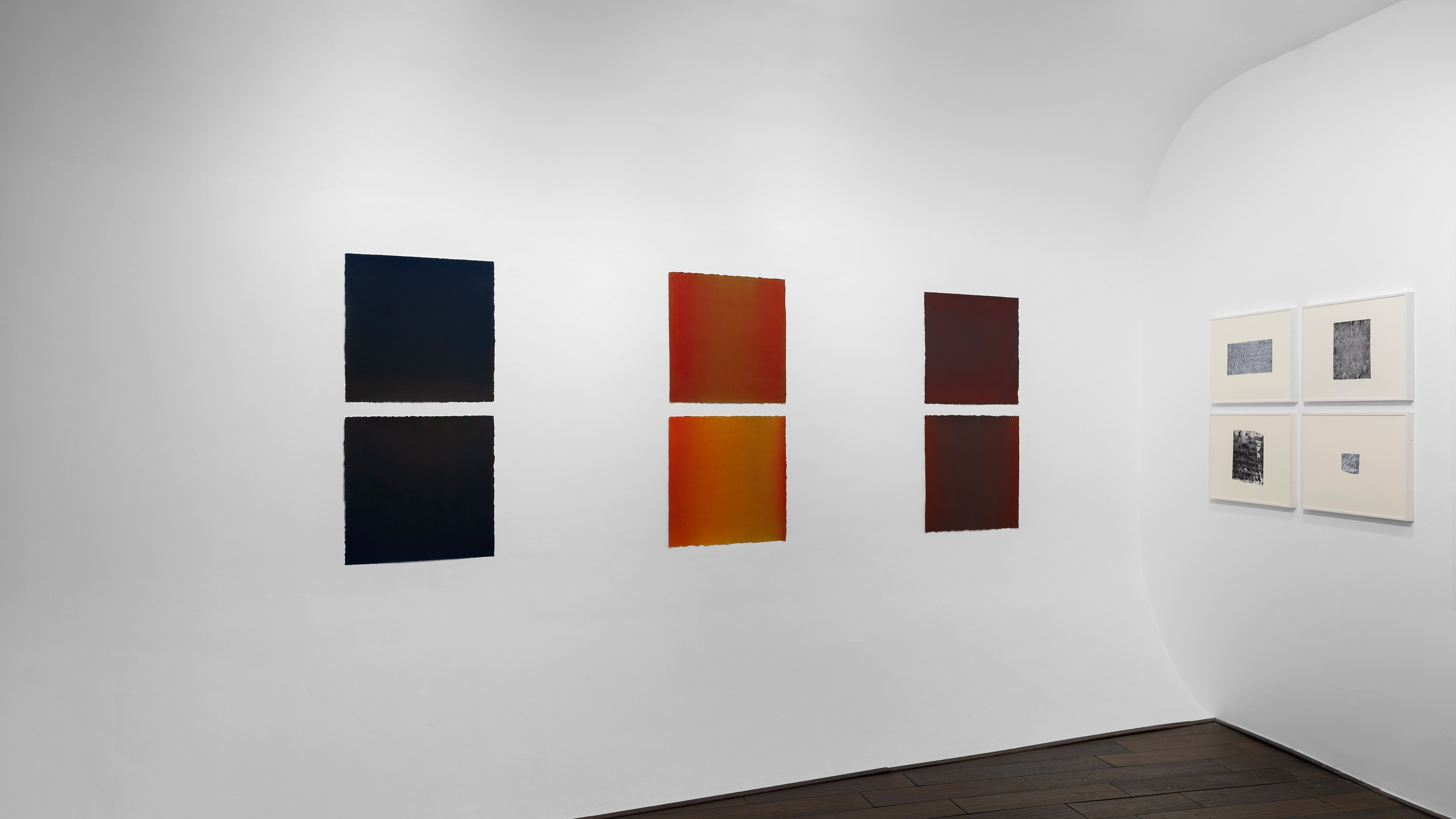
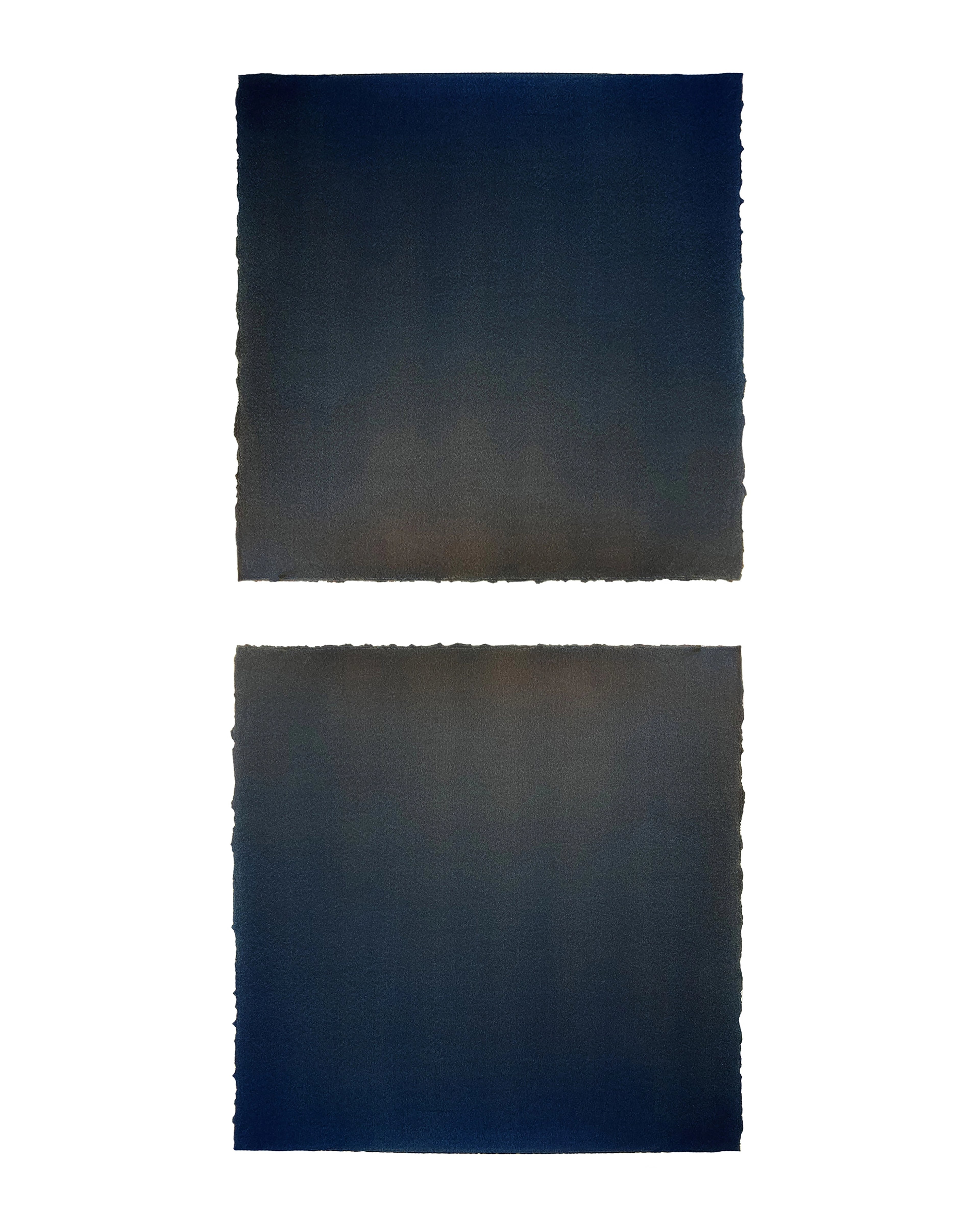
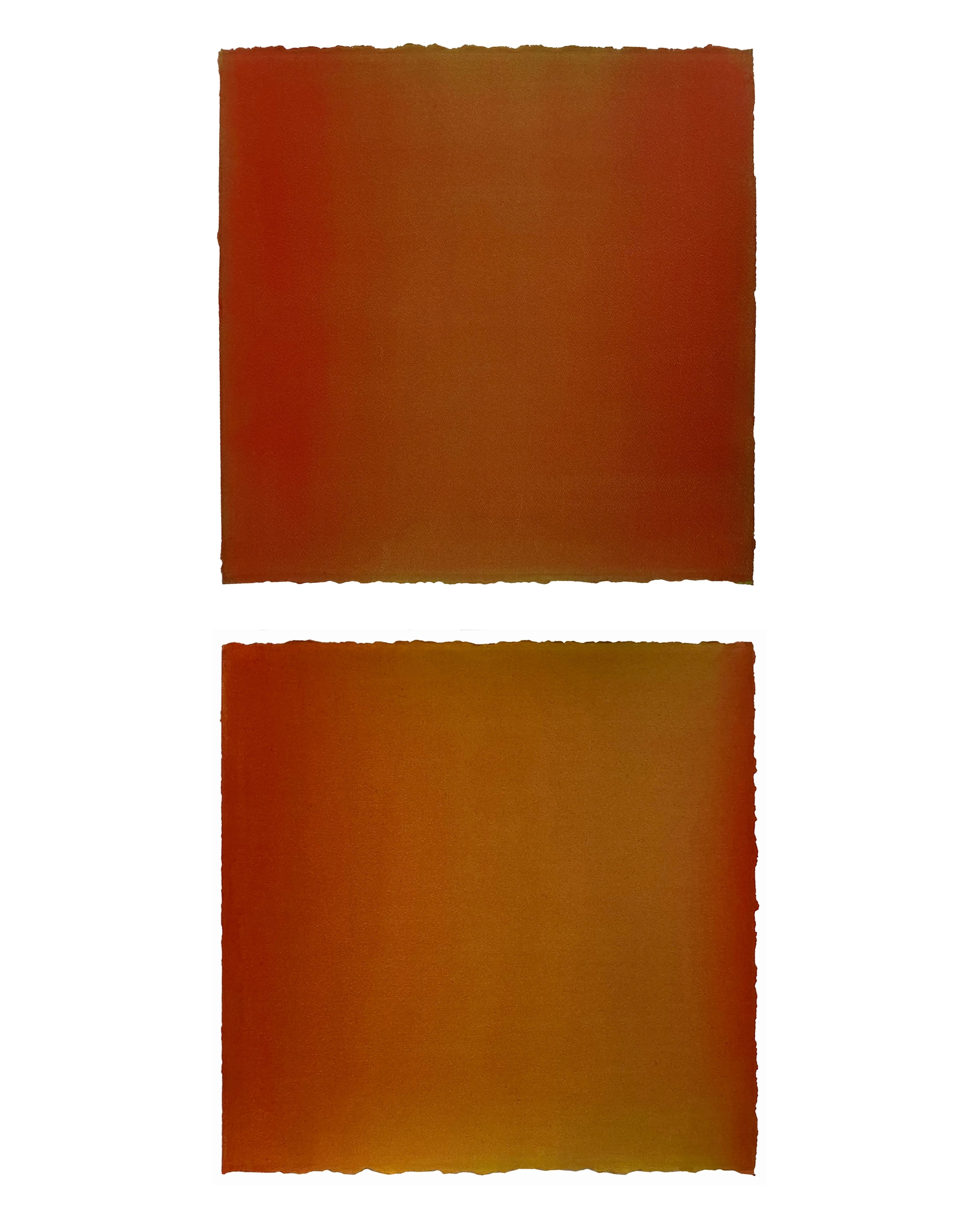
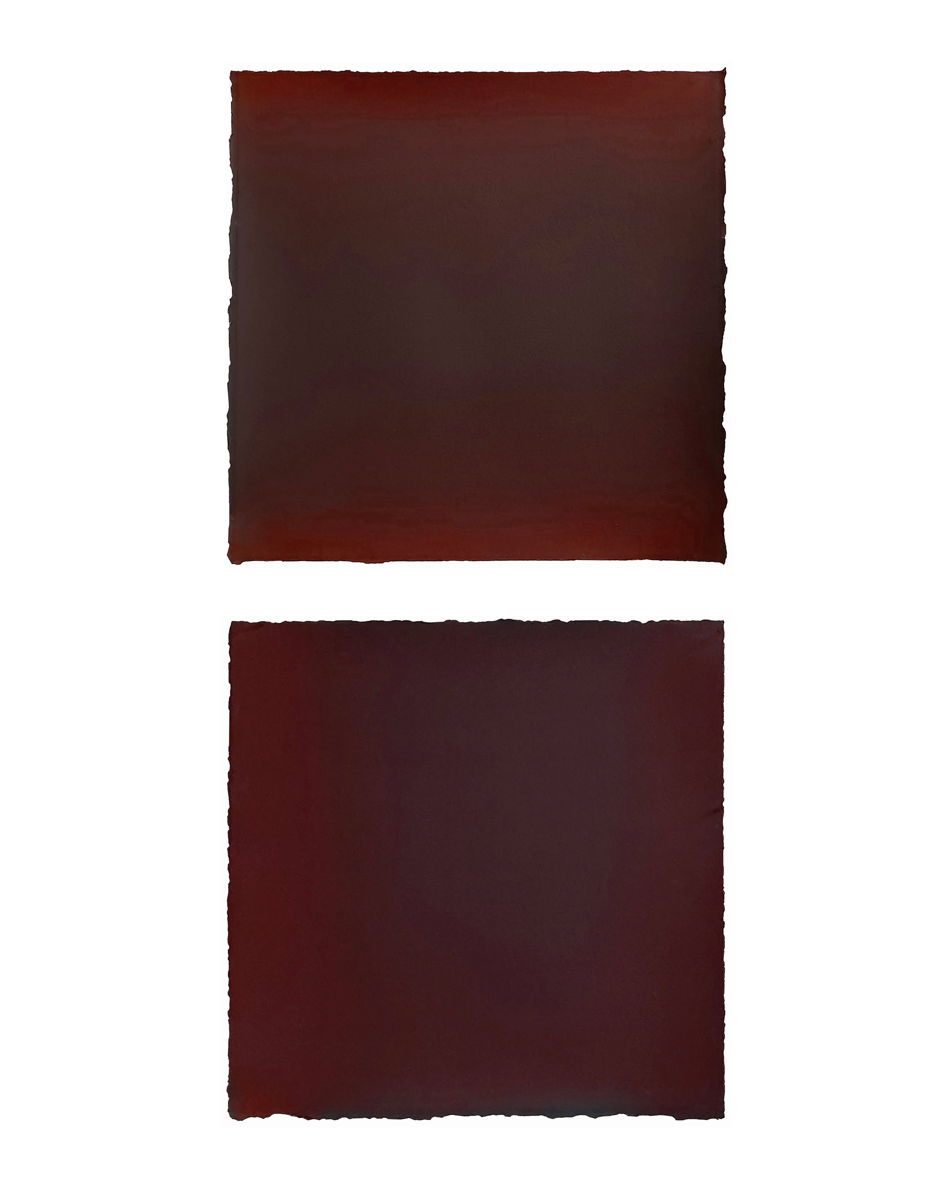
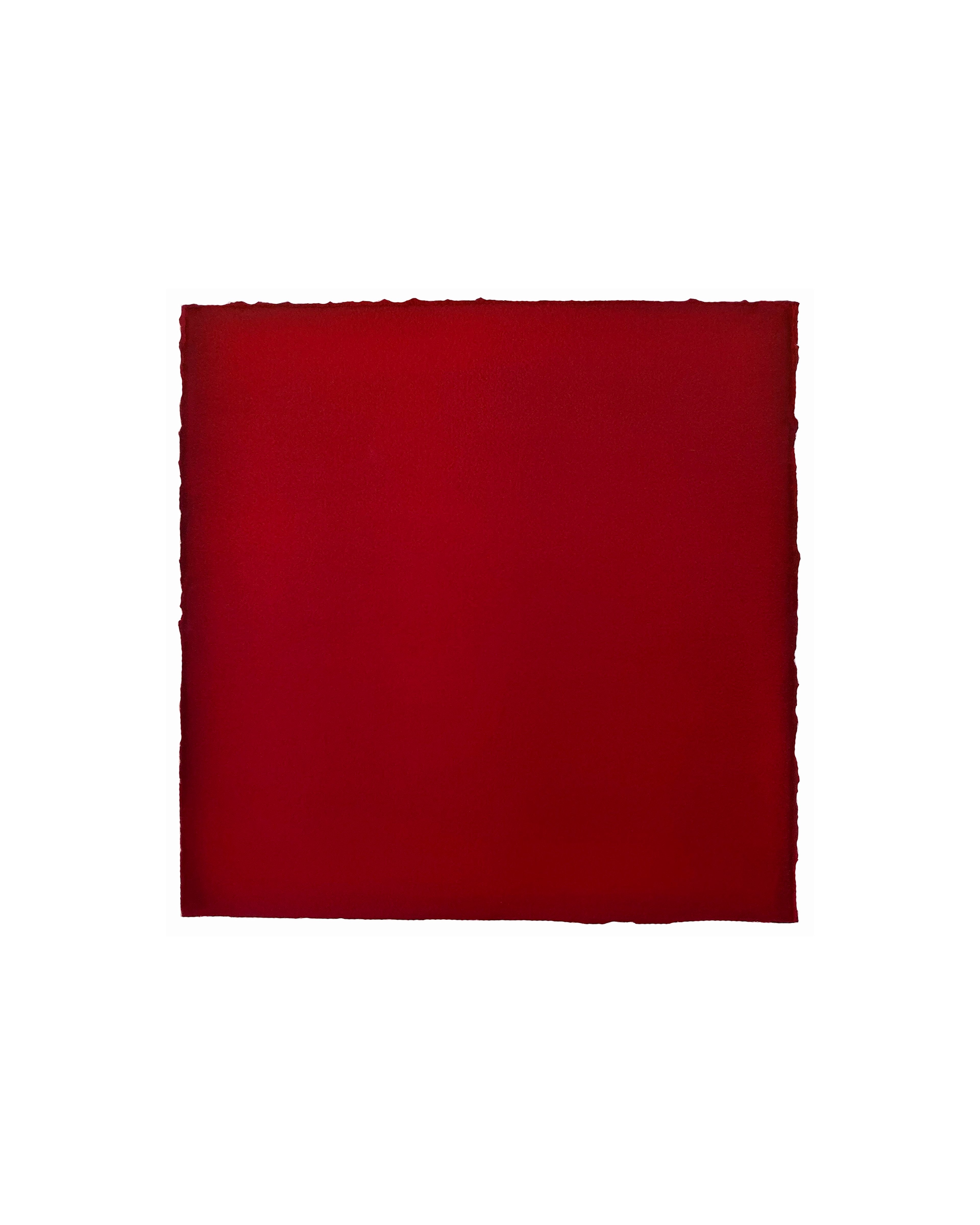
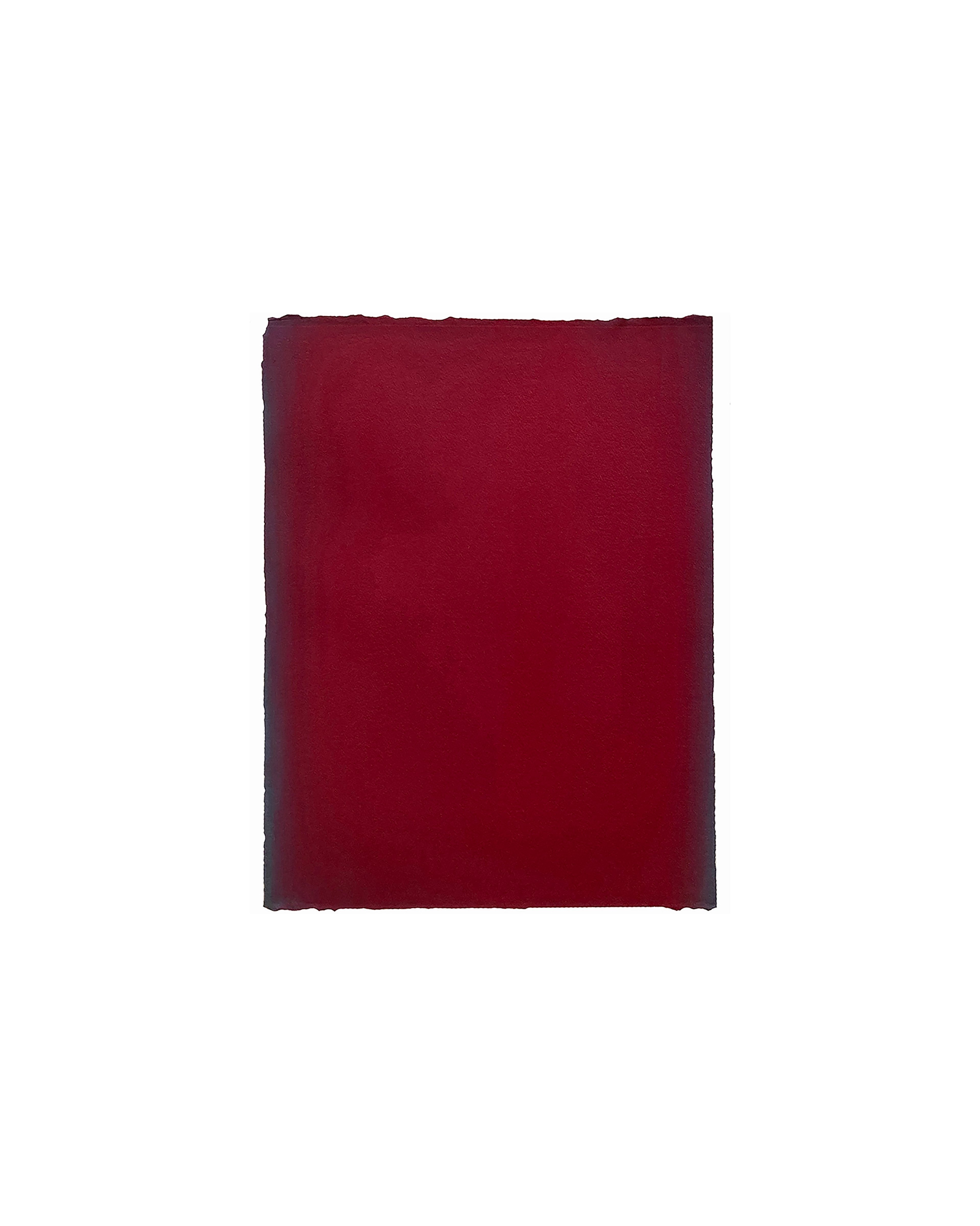
Alongside these small-scale watercolours, the exhibition also features a suite of recent 'colour-field watercolours'. Here, the artist is creating watercolour solutions with organic and inorganic pigments; these ‘colour-field’ watercolours are created on large 300 lb. cold press papers, which record multiple washes of paint. Made often over long periods, a rich volume and surface is created with up to 50-60 thin layers of paint. The term ‘colour-field’ painting is often associated with ‘monochrome’ painting, and some of these recent paintings by Nick Terry at first appear monochromatic – comprising one pigment. Terry has researched these definitions and interpretations, reminding us that there is ‘no such thing as monochrome’, only the presumption of it. Colour is not material; it is light, with light refraction, to be precise. For instance, when we see a monochromatic cadmium red painting, where only one pigment has been employed, the mono (one) chrome we see is light refracting off of one slice of the full-colour spectrum. When the light shifts, we see a different value of red, which, in effect, is a different colour. Think of a red car you saw at lunch and then at night.
Coupled with Terry’s interest in visual presumption is his long inspiration from the paintings and findings of JMW Turner. Turner realised that in composition (as in life), there needs to be the representation of complementary forces of warm and cool tones to balance and harmonise the pictorial elements; because these forces exist in nature, they must be represented in the portrayal of the essence of nature. Warm colours in Turner’s skies balance the cooler tones of the waters below. So, too, in Terry’s watercolours – drawing out the dynamic range of the entire, primarily suppressed colour spectrum of one of his paintings, where cerulean blue dominates the main body of the painting composition, upon more absorptive observation, one begins to see delicate washes of warmer tones, often along the edges. These relatively warmer tones serve to balance and ‘show off’ the dominant characteristics of how we perceive the cerulean focus whilst alluding to its hidden associative properties. This is beautifully seen in a composition where a viridian pigment takes centre stage, its cool dominant properties complimented by the warm addition of azo red and red oxide washes along the periphery. ‘All pigments, all colours are beautiful, but to really bring them to life, to show their whole inherent range, I find I need to add a complimenting colour and value to the composition.’
As we experience the paintings in this exhibition, we revel in the limitless possibilities that Nick Terry's processes offer. Each painting provides a universe of visual information as unique as our perception.
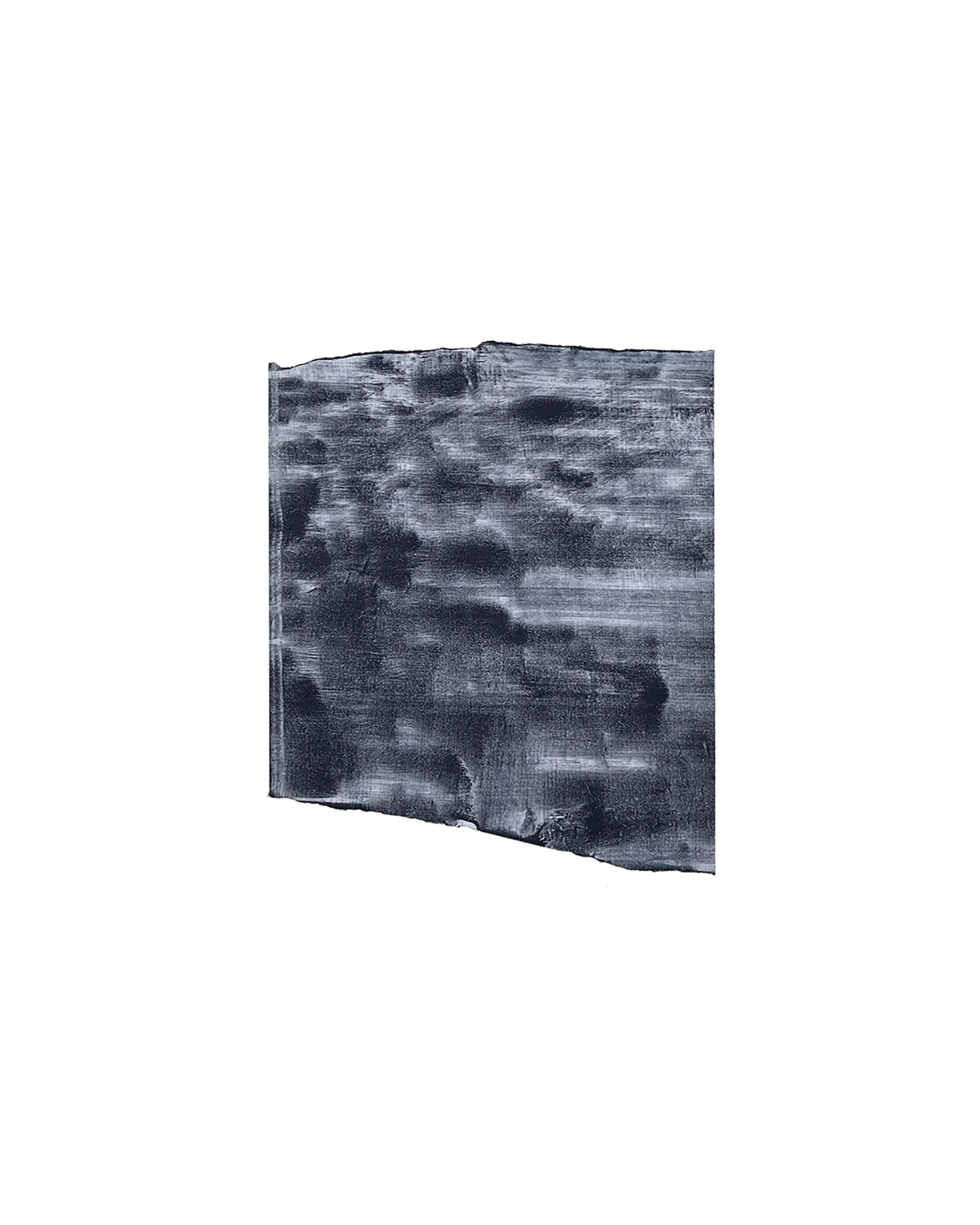
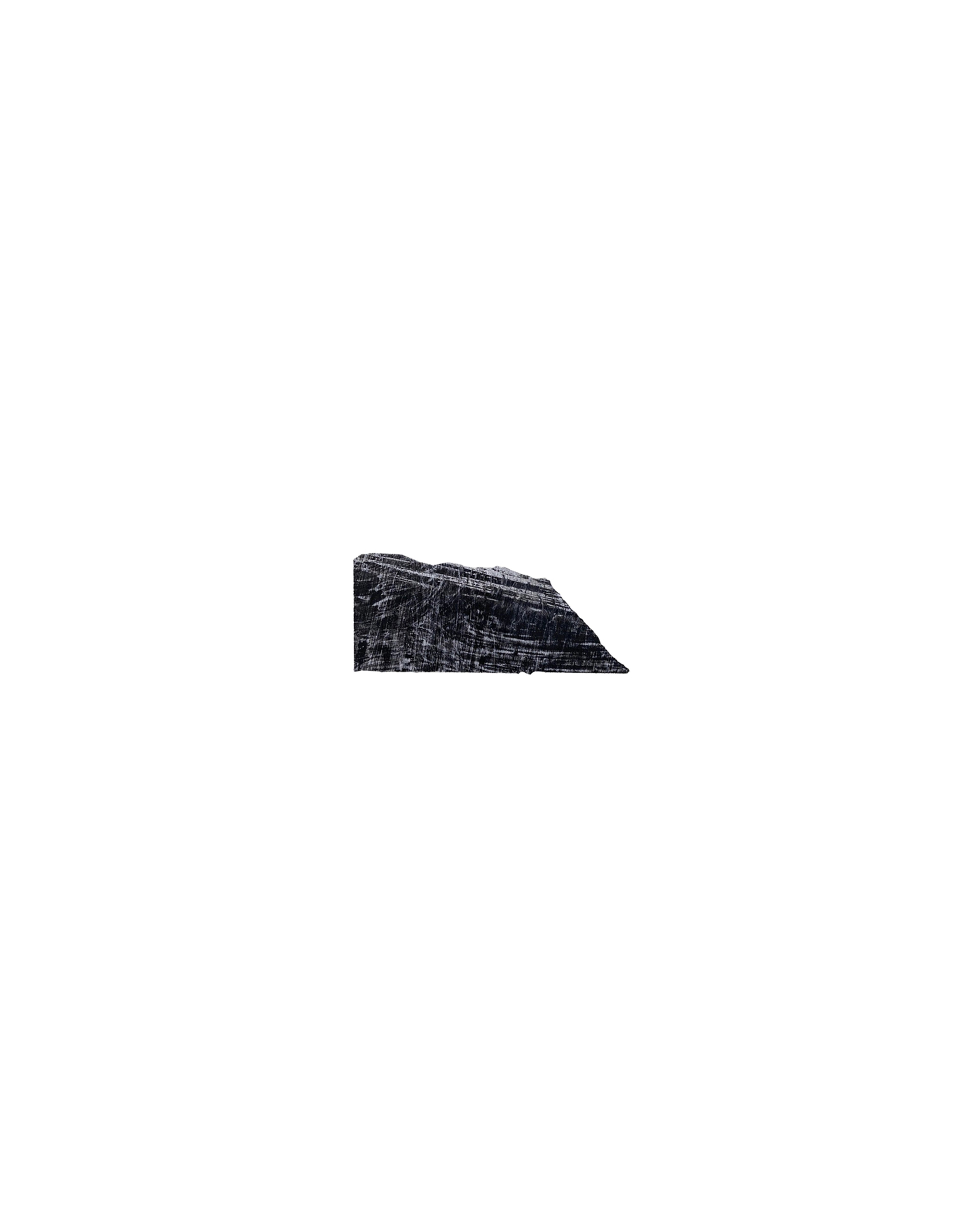
Nick Terry
Untitled (LDN24_1), 2024
Watercolour on paper
40.6 × 50.8 cm
16 × 20 in
Price on request
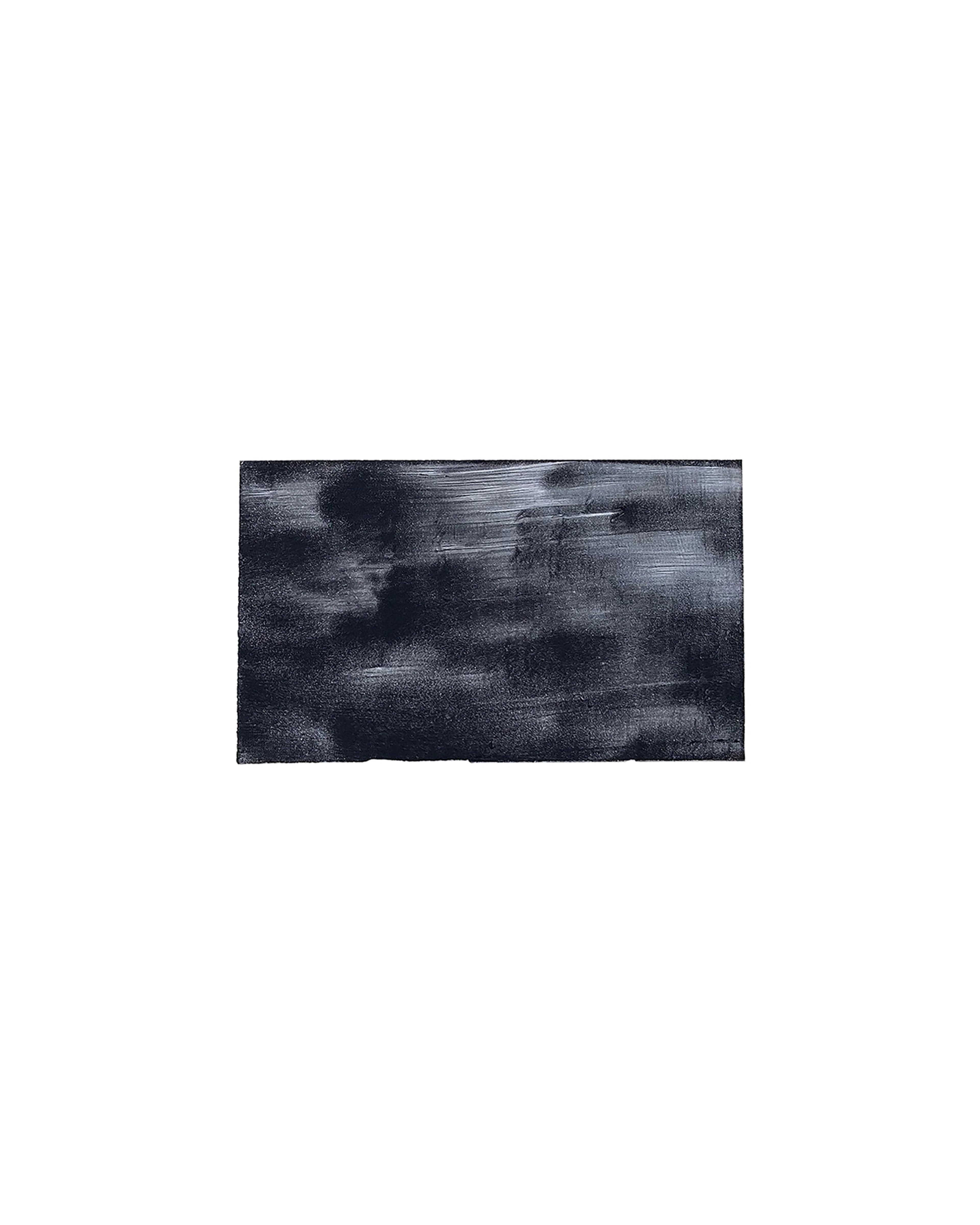
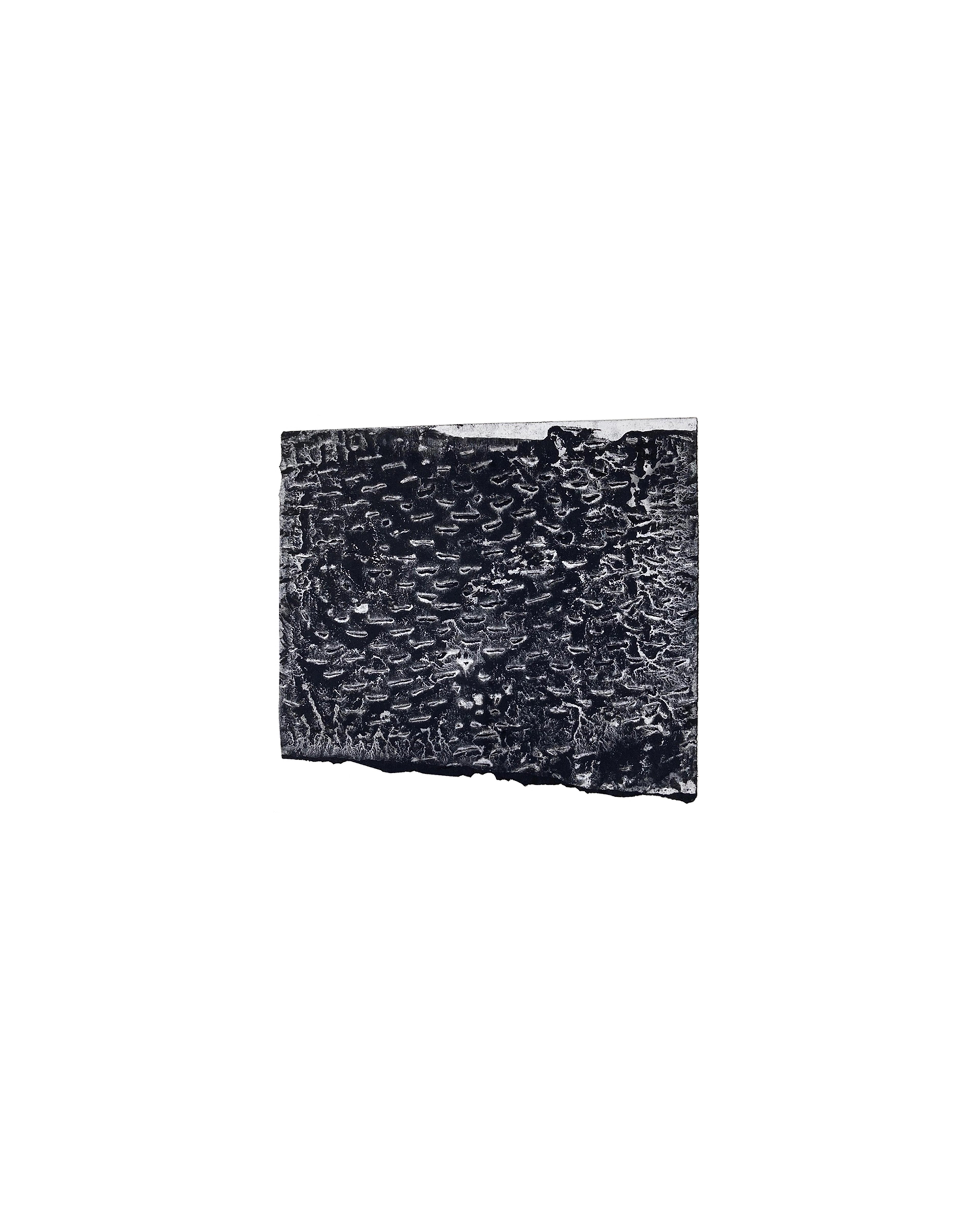
Nick Terry
Untitled (LDN24_2), 2024
Watercolour on paper
40.6 × 50.8 cm
16 × 20 in
Price on request
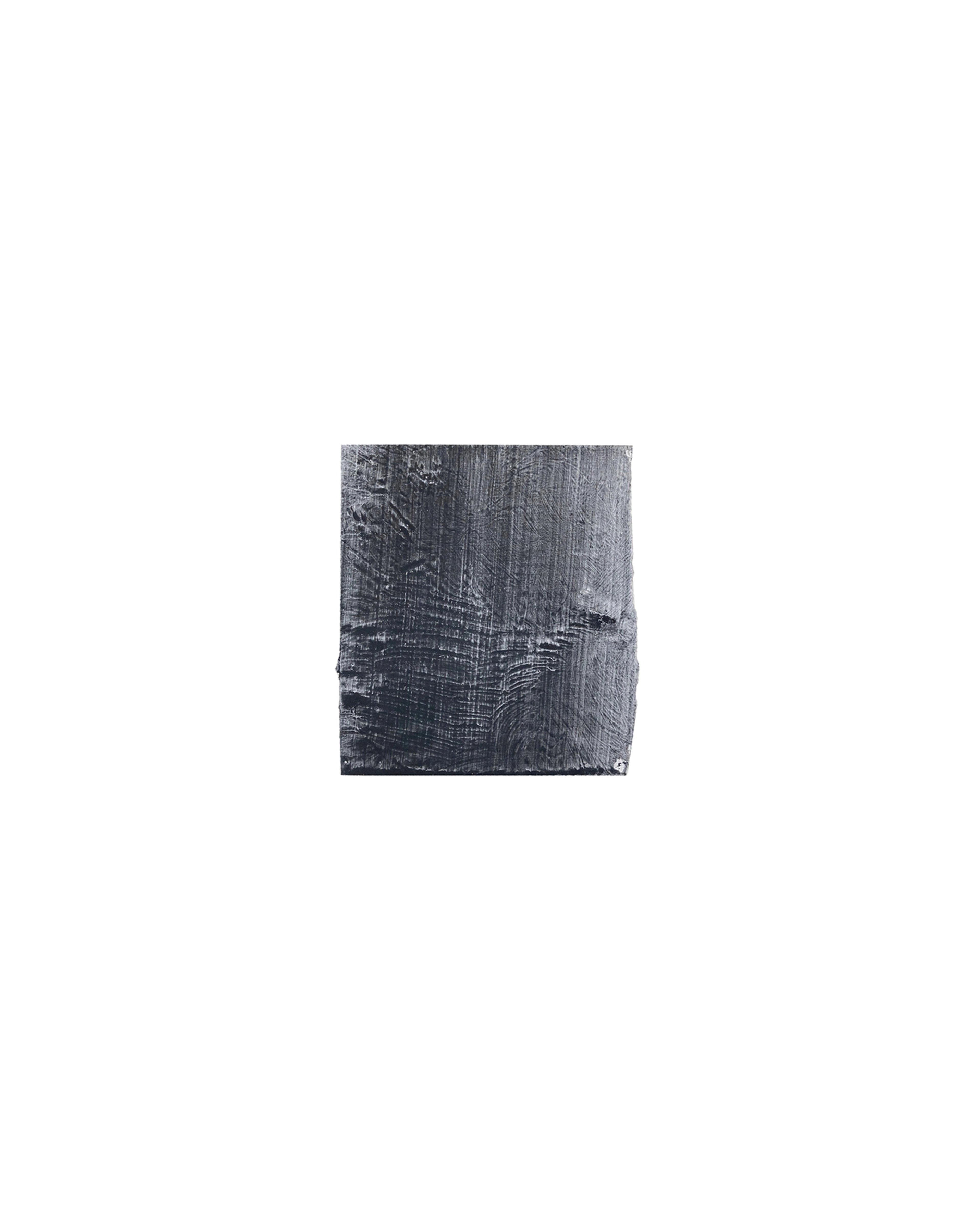
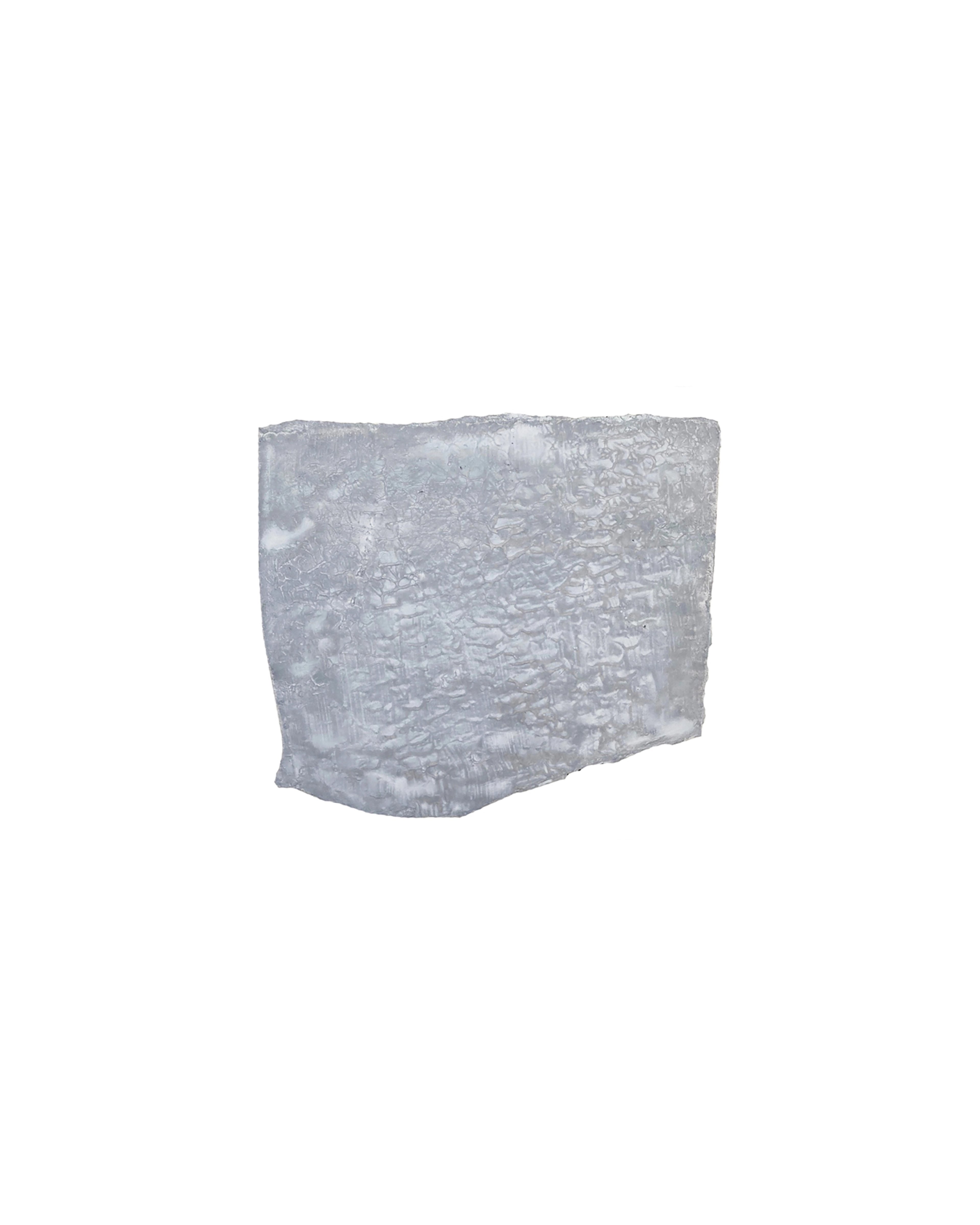
Nick Terry
Untitled (LDN24_3), 2024
Watercolour on paper
40.6 × 50.8 cm
16 × 20 in
Price on request
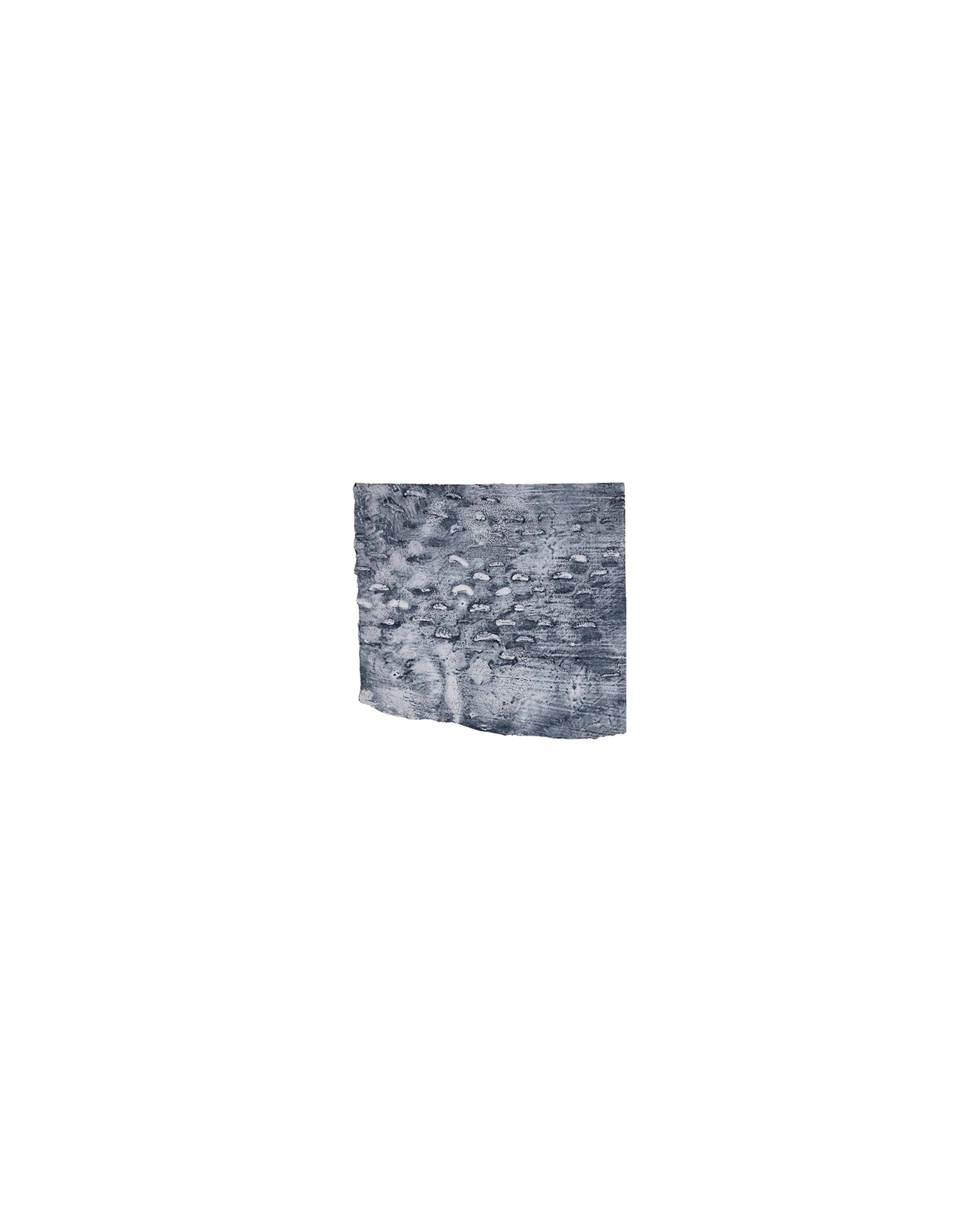
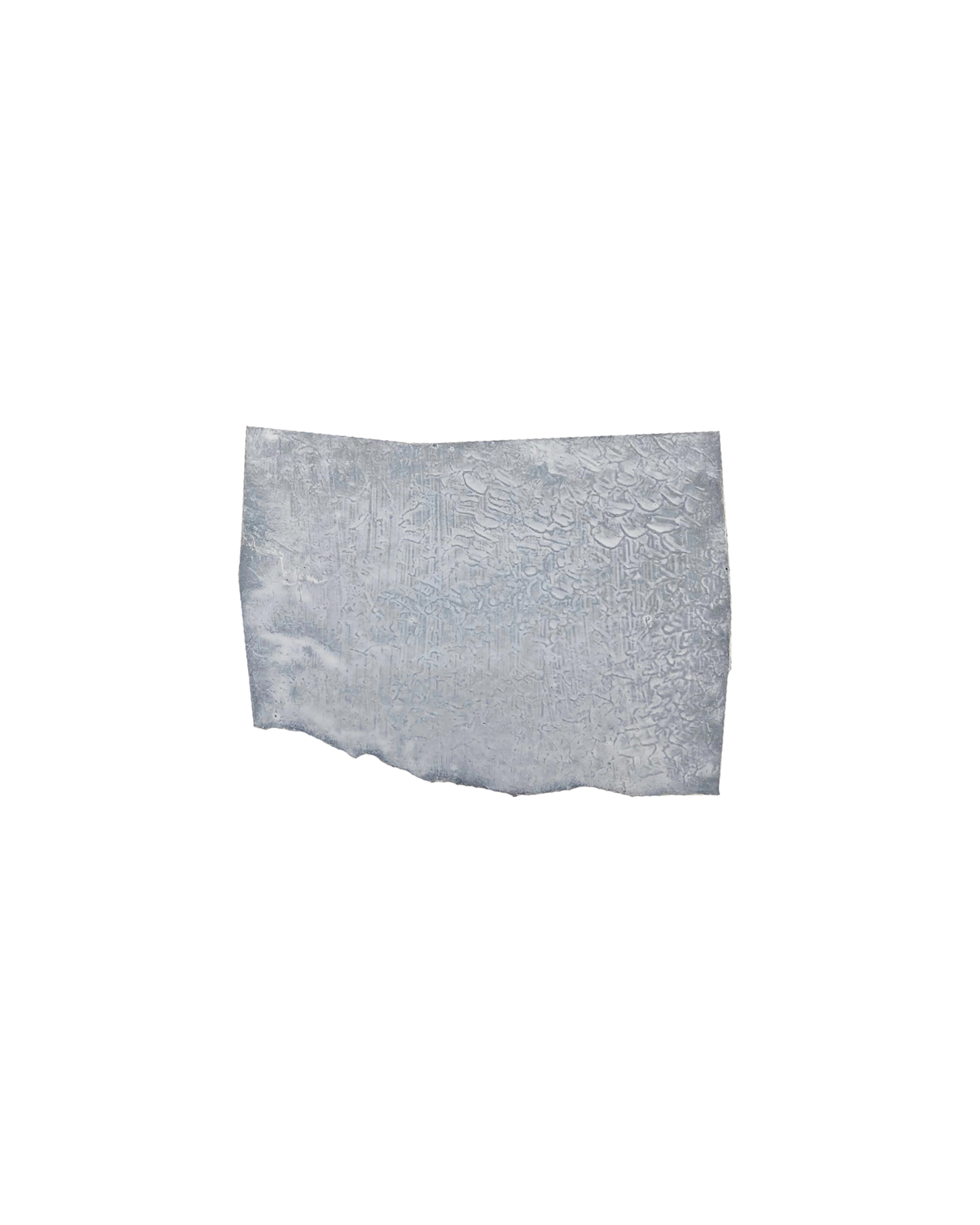
Nick Terry
Untitled (LDN24_4), 2024
Watercolour on paper
40.6 × 50.8 cm
16 × 20 in
Price on request
Nick Terry
Untitled (LDN24_5), 2024
Watercolour on paper
40.6 × 50.8 cm
16 × 20 in
Price on request
Nick Terry
Untitled (LDN24_6), 2023
Watercolour on paper
40.6 × 50.8 cm
16 × 20 in
Price on request
Nick Terry
Untitled (LDN24_7), 2024
Watercolour on paper
40.6 × 50.8 cm
16 × 20 in
Price on request
Nick Terry
Untitled (LDN24_8), 2023
Watercolour on paper
40.6 × 50.8 cm
16 × 20 in
Price on request
Nick Terry
Untitled (LDN24_9), 2024
Watercolour on paper
40.6 × 50.8 cm
16 × 20 in
Price on request
Nick Terry
Untitled (LDN24_10), 2024
Watercolour on paper
40.6 × 50.8 cm
16 × 20 in
Price on request
Nick Terry
Untitled (LDN24_11), 2024
Watercolour on paper
40.6 × 50.8 cm
16 × 20 in
Price on request
Nick Terry
Untitled (LDN24_12), 2023
Watercolour on paper
40.6 × 50.8 cm
16 × 20 in
Price on request
Nick Terry
Diptych: Burnt Sienna and Milori, 2024
Pigment on 300 lb. cold press watercolour paper
121.7 × 57.1 cm
47 ⅞ × 22 ½ in
Price on request
Nick Terry
Diptych: Untitled - Apples, 2024
Pigment on 300 lb. cold press watercolour paper
121.7 × 57.1 cm
47 ⅞ × 22 ½ in
Price on request
Nick Terry
Diptych: Untitled - Plums, 2024
Pigment on 300 lb. cold press watercolour paper
121.7 × 57.1 cm
47 ⅞ × 22 ½ in
Price on request
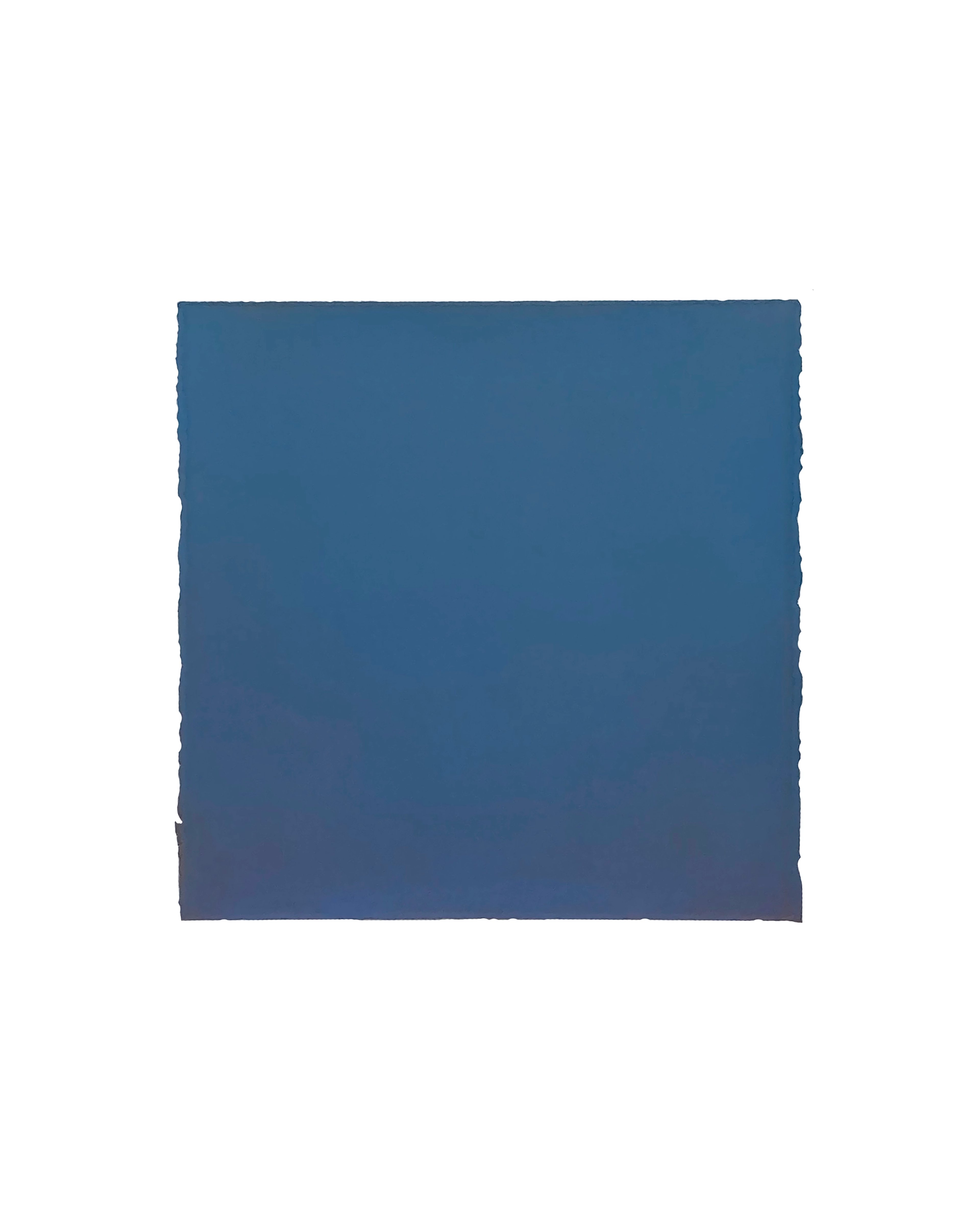
Nick Terry
Cerulean, 2024
Pigment on 300 lb. cold press watercolour paper
57.1 × 57.1 cm
22 ½ × 22 ½ in
Price on request
Nick Terry
Plum (Square), 2024
Pigment on 300 lb. cold press watercolour paper
57.1 × 57.1 cm
22 ½ × 22 ½ in
Price on request
Nick Terry
Plum (Tall), 2024
Pigment on 300 lb. cold press watercolour paper
38.1 × 50.8 cm
15 × 20 in
Price on request